



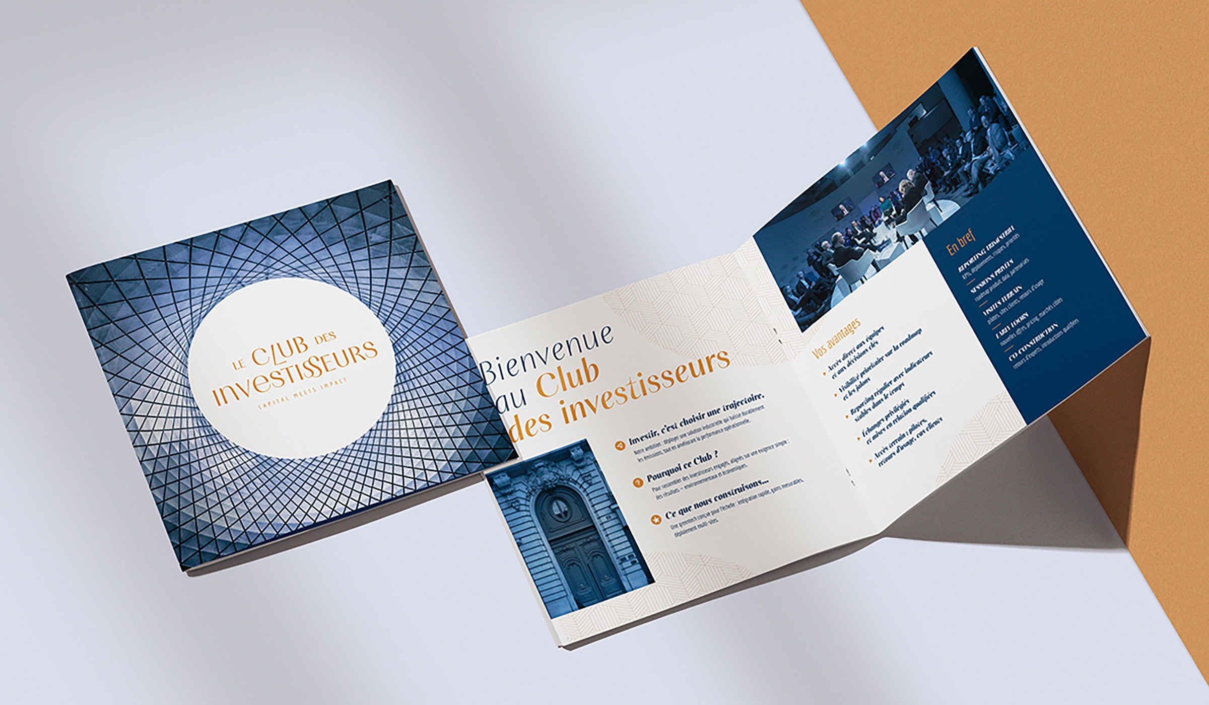
Livre blanc éco-conçu
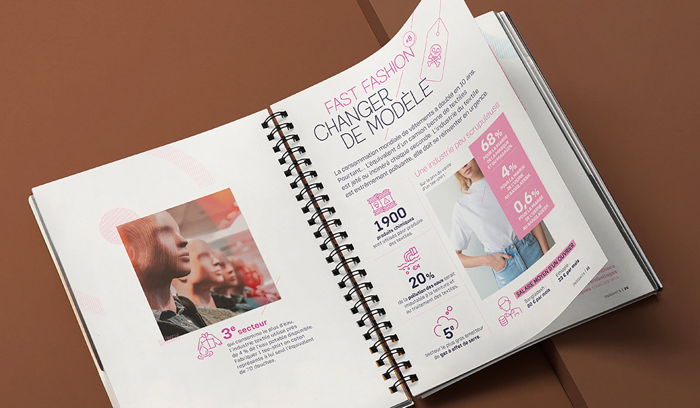
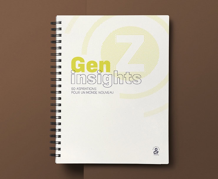
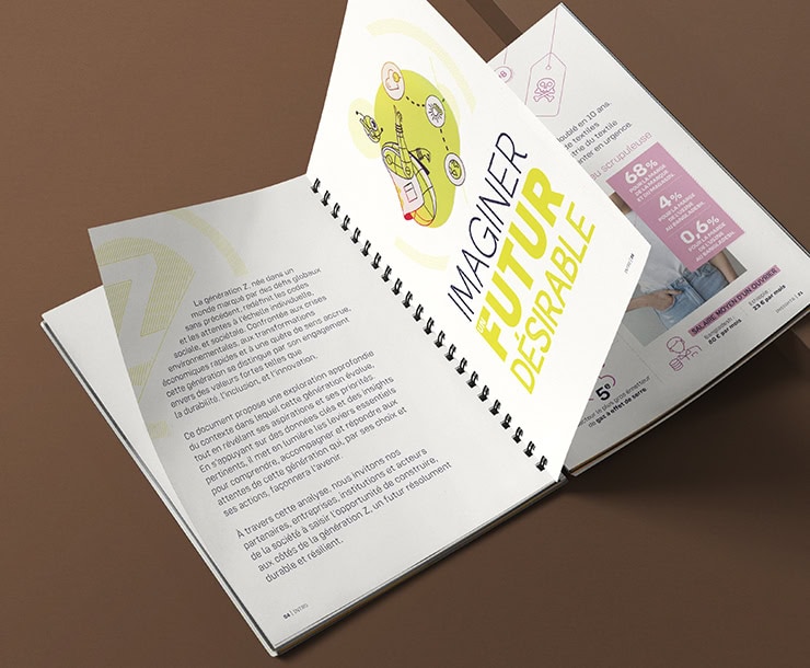
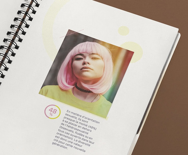
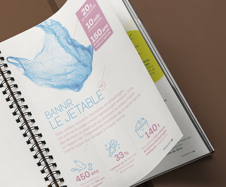
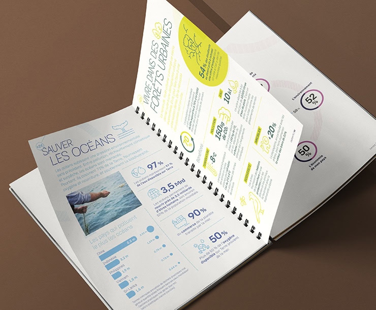
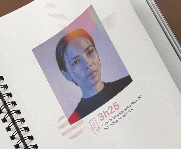
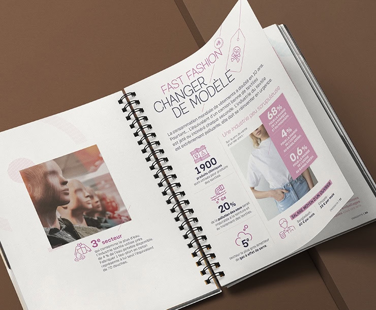
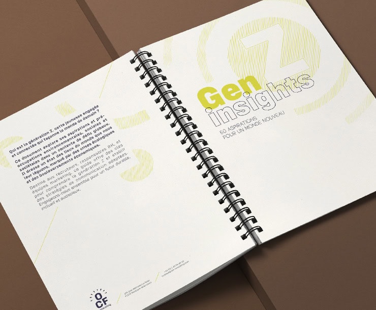
Kraft Design has created an eco-responsible white paper for a consulting firm, analyzing Gen Z expectations. Combining creativity, storytelling, and eco-design, this project features a strong visual identity, FSC paper made from corn residue, vegetable-based inks, and certified local printing. A premium, clear, and sustainable medium reflecting our expertise in graphic design and responsible printing. Nous appliquons la même exigence de fabrication à nos projets de rapports RSE et documents institutionnels éco-conçus.
Areas of intervention:
- Branding strategy
- Visual identity creation (logo, brand guide)
- Responsible printing
- Sustainable promotional object design
- Global support

B2B Branding
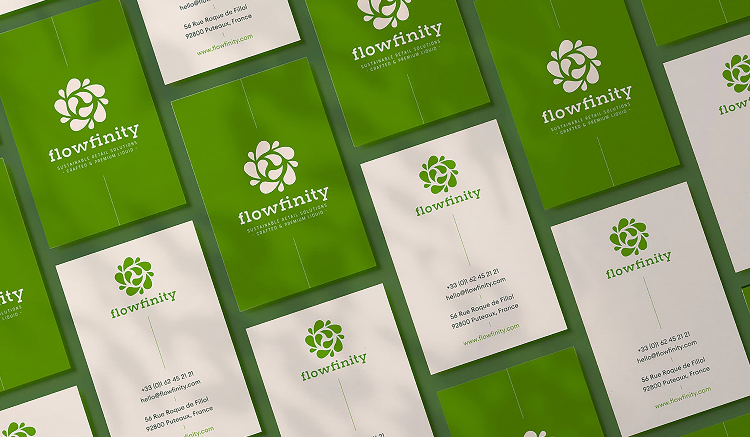
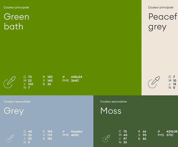
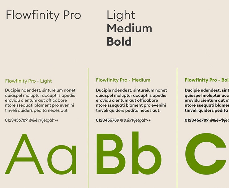
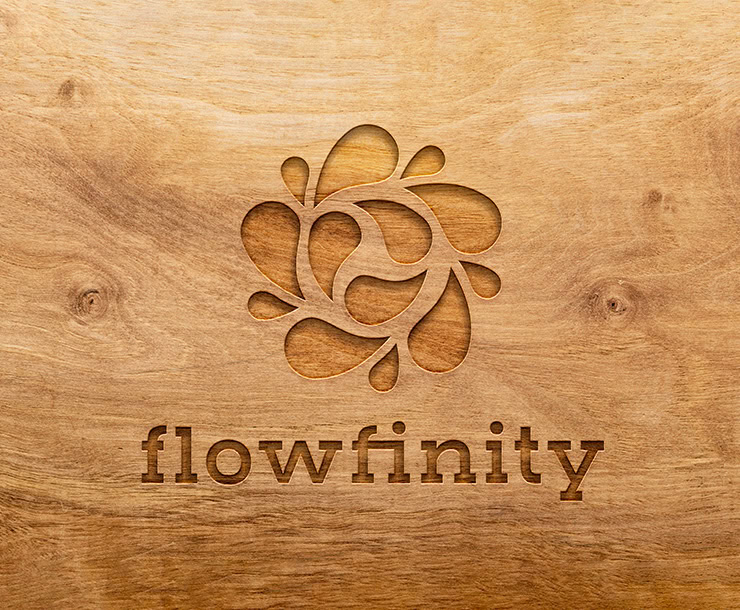
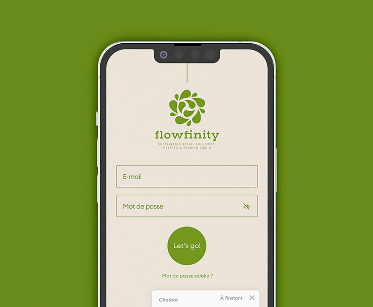
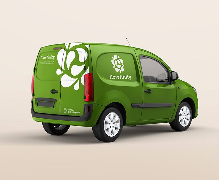
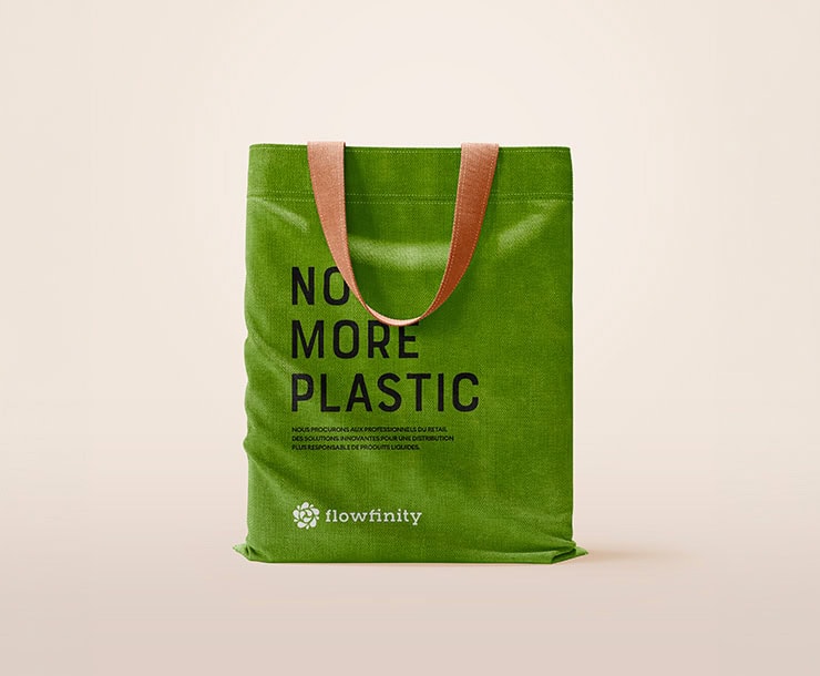
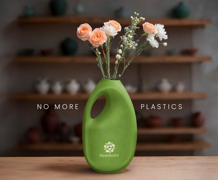
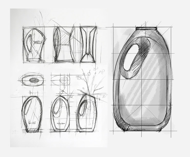
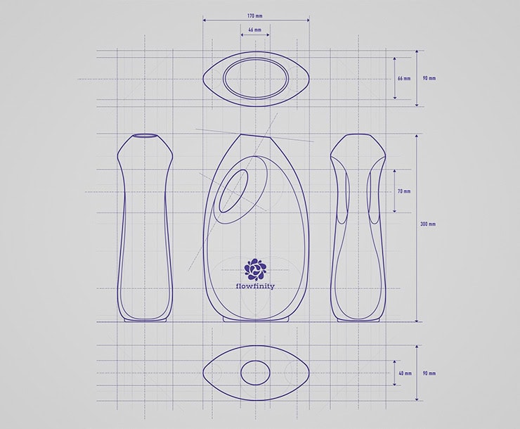
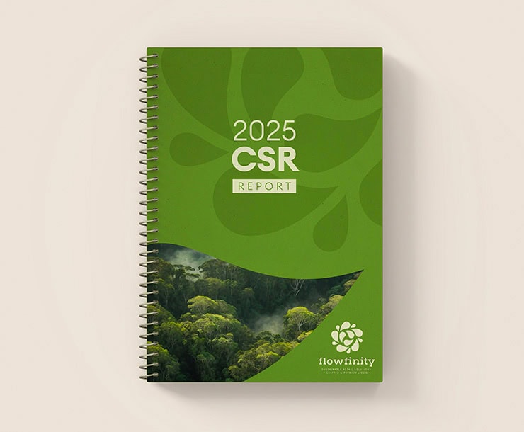
Kraft Design created the visual identity for Flowfinity, a B2B expert in bulk liquid logistics. Our mission: a consistent and engaging brand identity, with a custom graphic charter, a symbolic logo, and eco-designed materials, including a CSR report on recycled paper. We also produced a handcrafted ceramic promotional item shaped like a laundry detergent can. This vase illustrates Flowfinity's ecological impact: reducing plastic. A strong identity, aligned with its values, to boost its visibility in the circular economy.
Areas of intervention:
- Branding strategy
- Visual identity creation (logo, brand guide)
- Responsible printing
- Sustainable promotional object design
- Global support
Branding
Green Energy
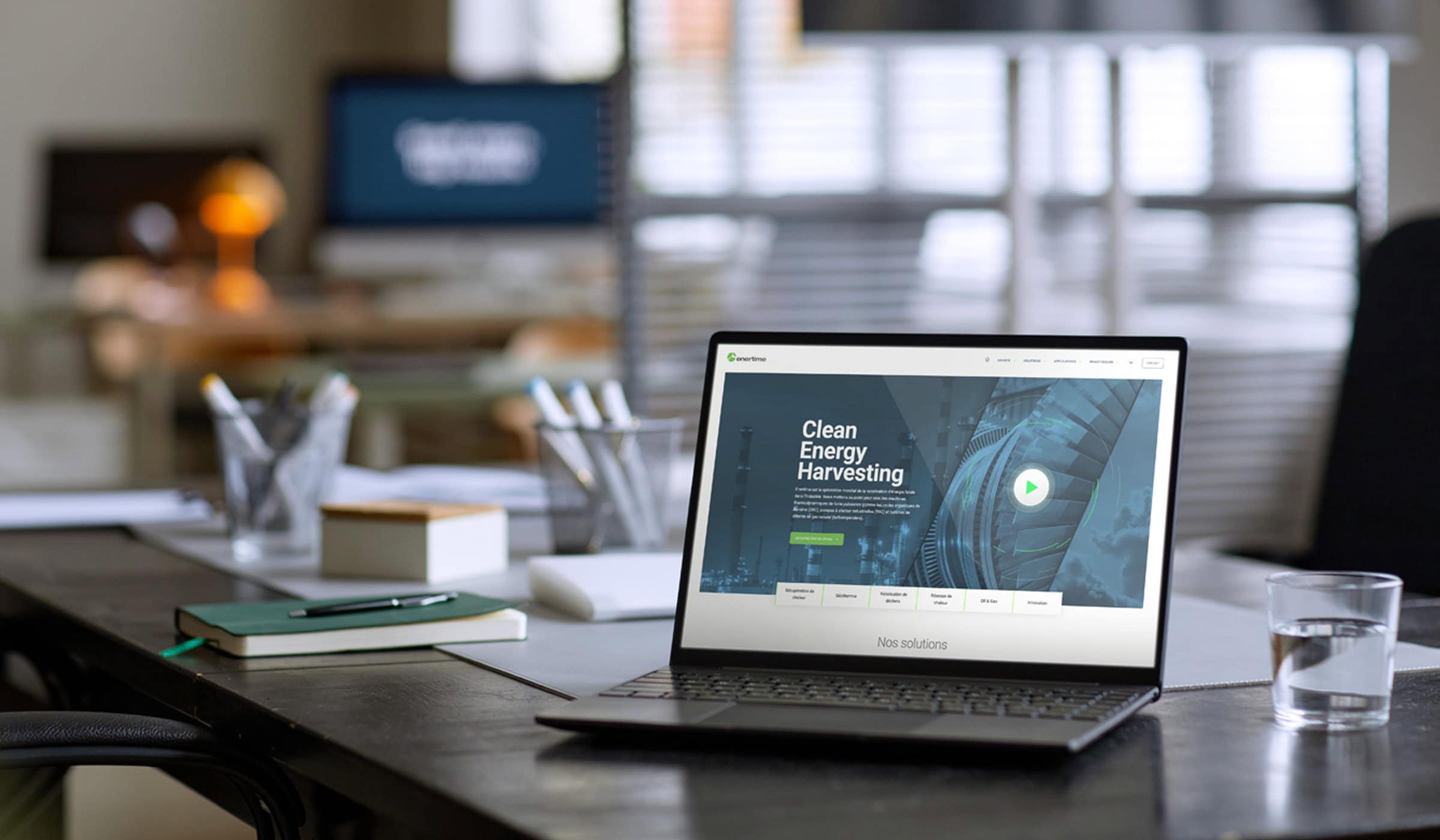
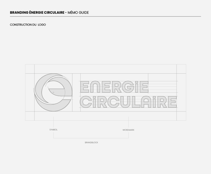
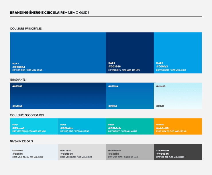
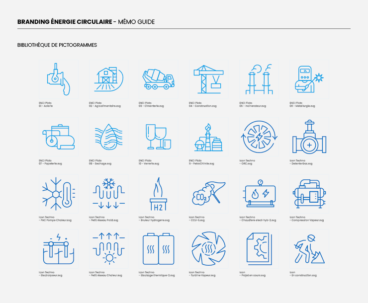
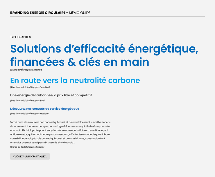
Kraft Design created the brand identity for “Energie Circulaire”, an energy services company specializing in industrial decarbonization and the recovery of waste energy. Our mission: to build a legitimate brand able to carry its technological, financial, and economic expertise to major industrial sites across Europe. An operational brand guideline, color palette, graphic assets, and industry-specific pictograms anchored a strong identity, rolled out across the new website and communication materials, notably for trade shows.
Areas of work:
- Brand Strategy / Branding
- Visual identity creation
- Brand guidelines, pictograms, graphic assets
- Website creation
- Print and digital communication materials
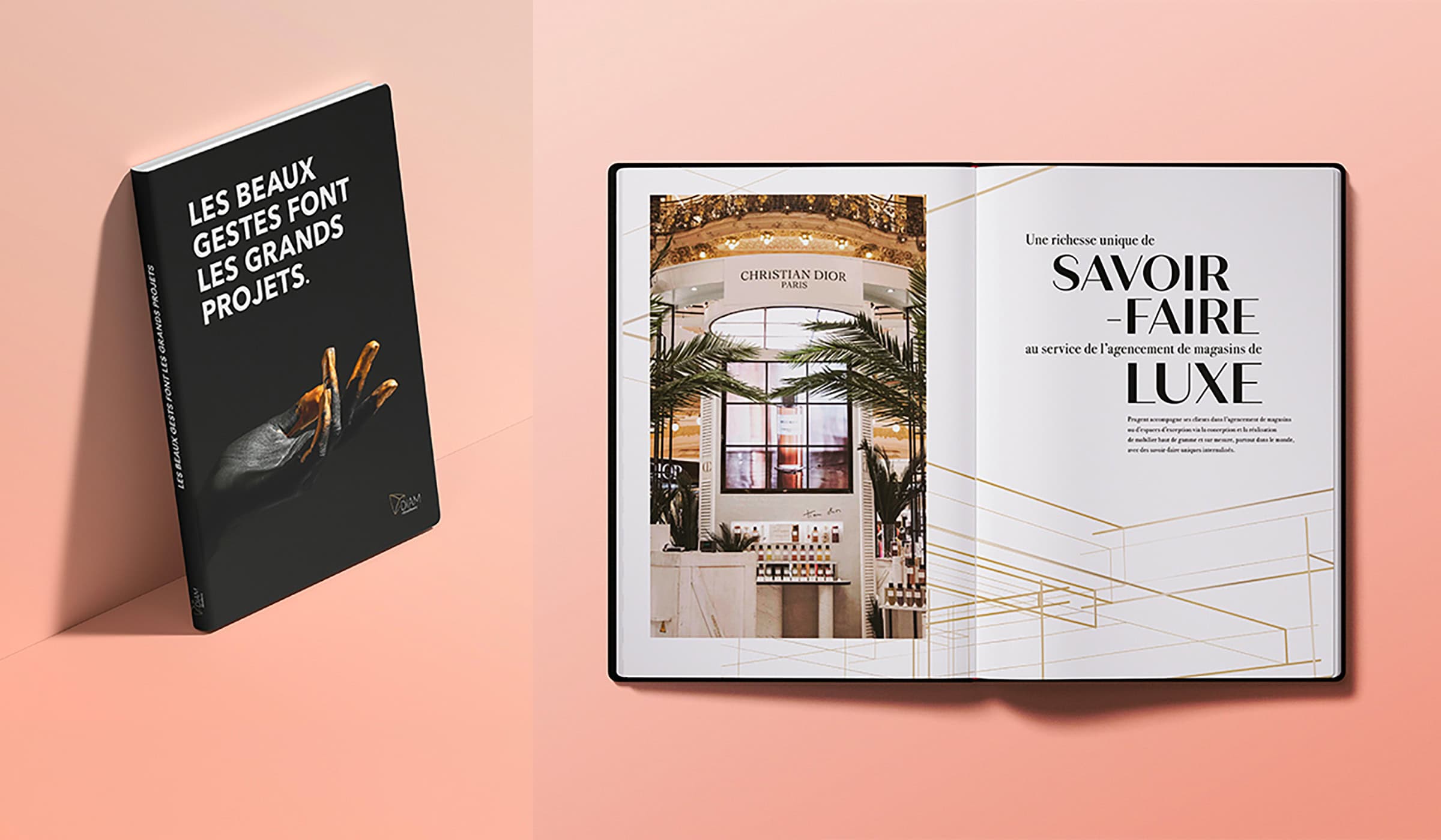
Luxury Skills Book
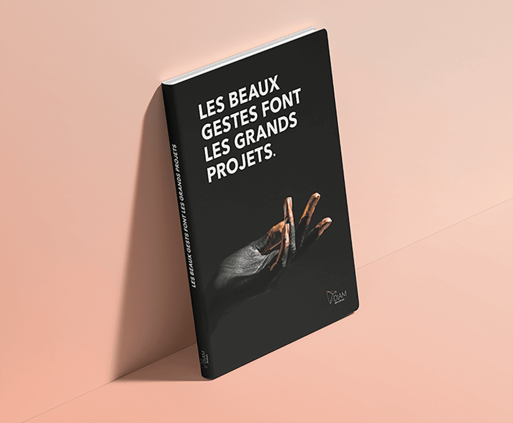
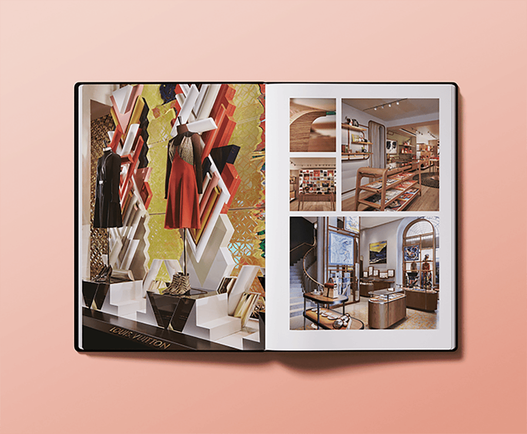
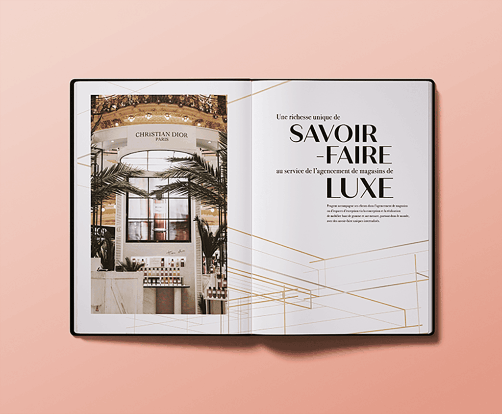
Kraft Design has created an exceptional book showcasing the artisanal expertise (wood, metal, glass, leather, etc.) mobilized for the implementation of retail spaces for the biggest luxury brands. This publication, combining rigorous editorial structuring and premium design, addresses a dual challenge: attracting talent from specialized schools and demonstrating to clients (leather goods, fashion, perfumery) the mastery of rare skills essential to their projects. A strategic tool, bridging recruitment and the showcasing of artisanal excellence in service of luxury.
Areas of intervention:
- Editorial structuring and content scripting
- Custom layout
- Creation of iconography and management of a rich image collection
- Design of an elegant and educational print support
- Tone adaptation to target art schools, artisans, and prestige clients
Internal CSR Visual Identity
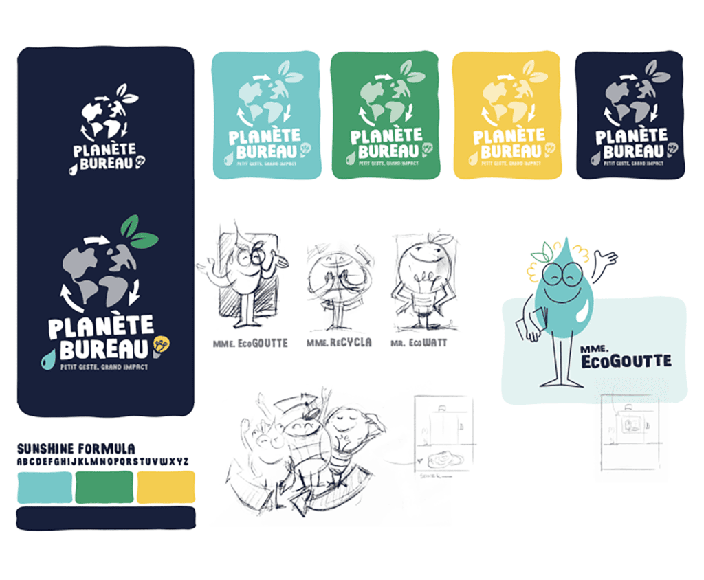
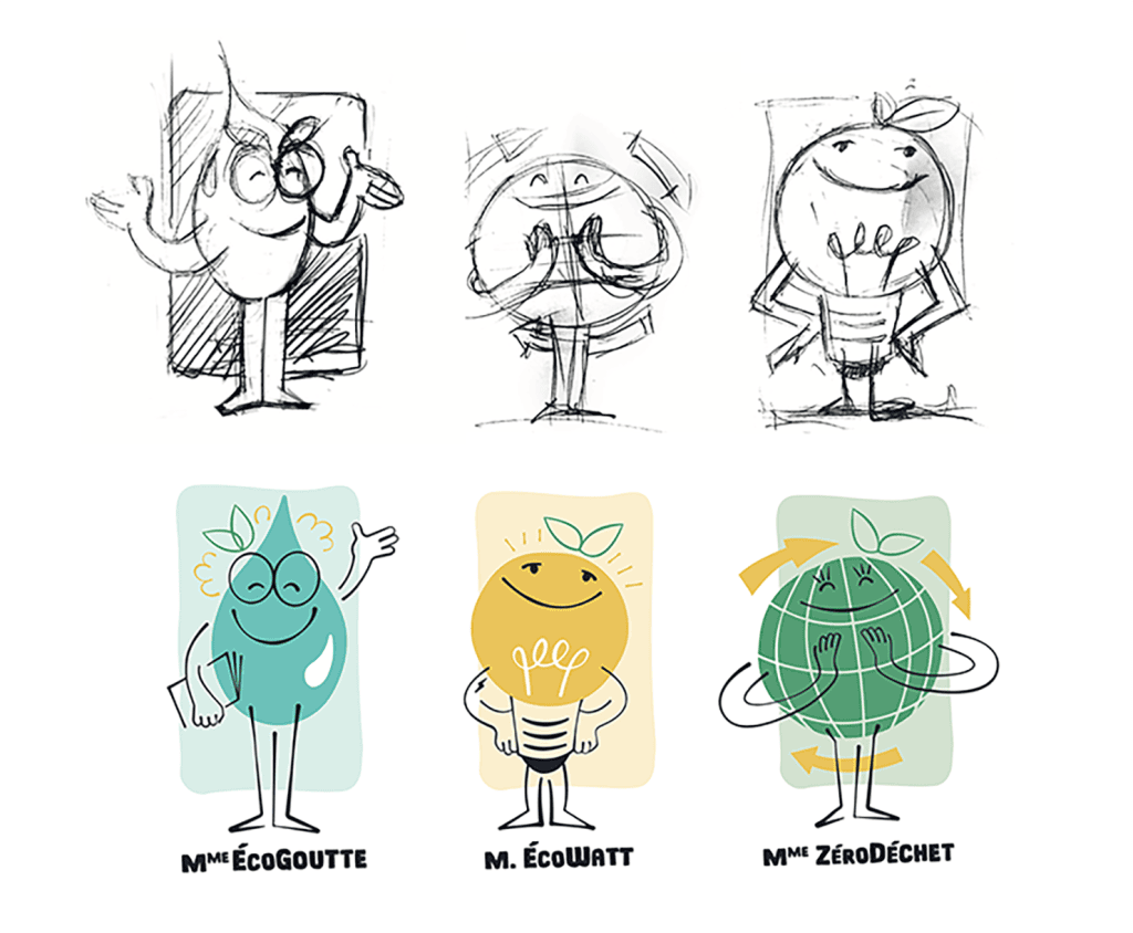
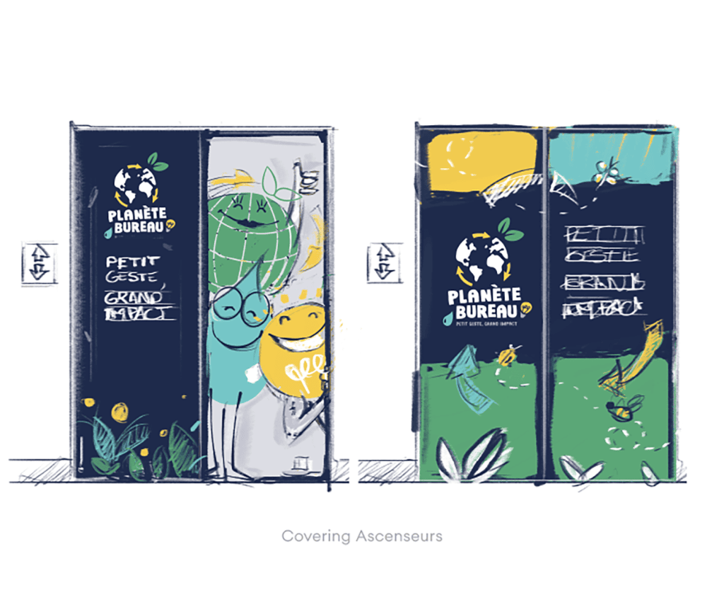
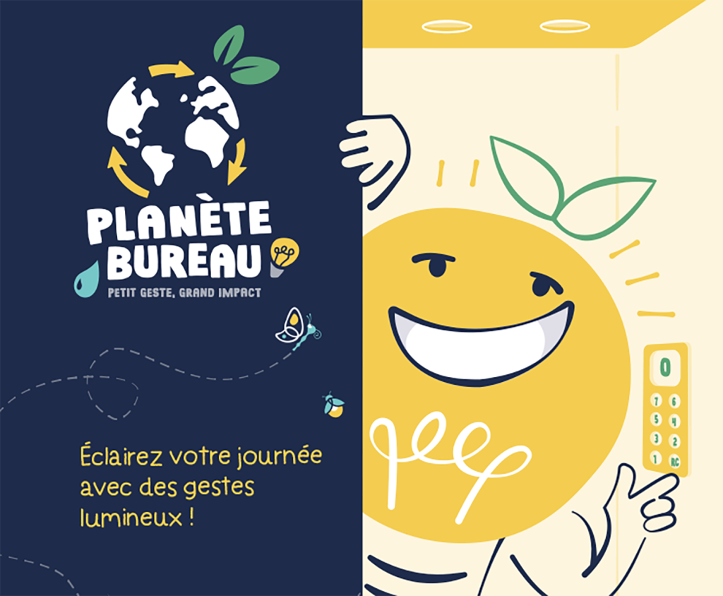
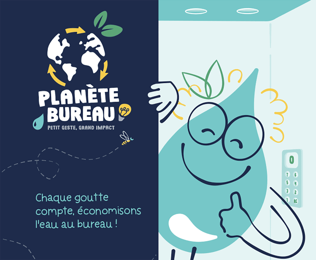
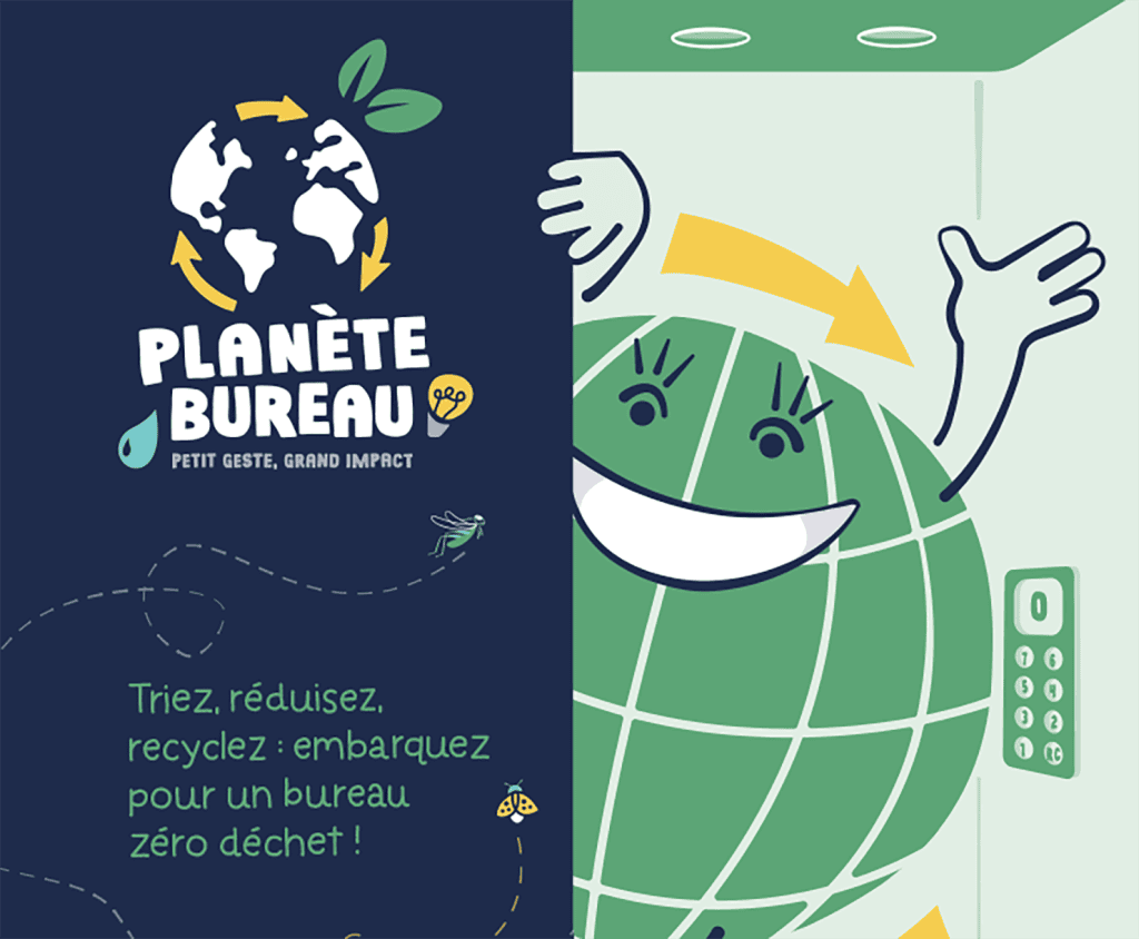
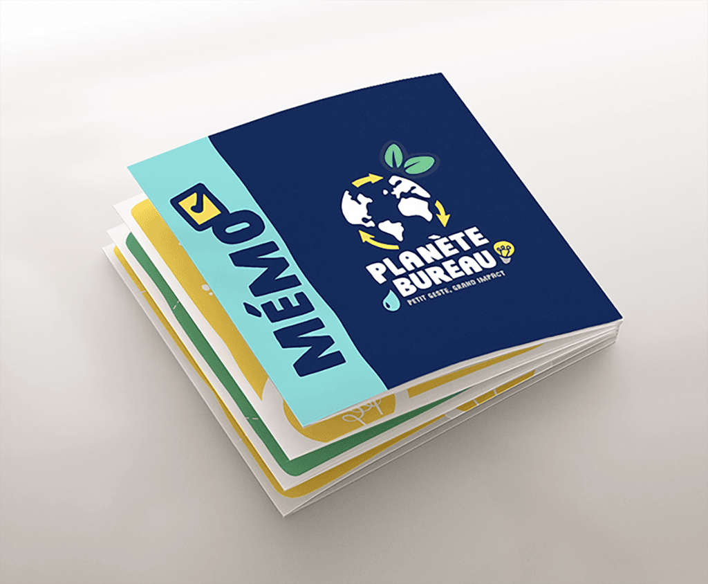
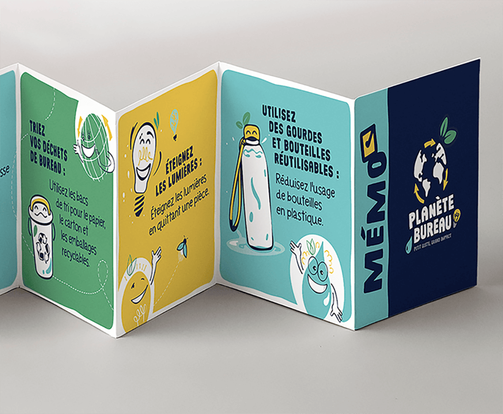
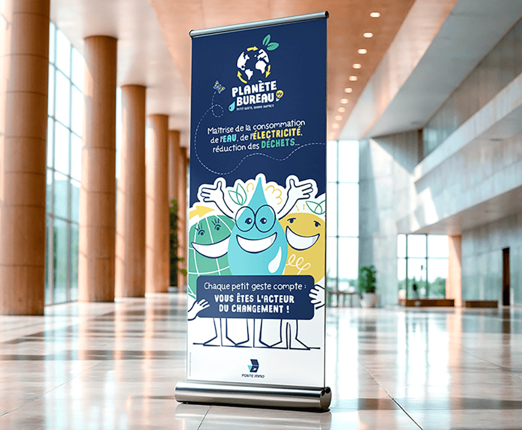
For La Poste Immobilier, we created the visual identity for “Planète Bureau,” a playful internal campaign featuring 3 mascots representing water, electricity, and waste. This included custom illustrations and adaptations for posters, roll-up banners, and print materials to ensure strong graphic consistency. The objective was to raise awareness of eco-friendly practices and embed a memorable CSR culture through an engaging visual universe tailored for large organizations. Nous retrouvons cette même exigence de cohérence graphique dans nos projets de rapports RSE annuels et de documents institutionnels éco-conçus.
Areas of intervention:
- Visual Identity Creation
- Thematic mascots (design and illustration)
- Internal communication supports
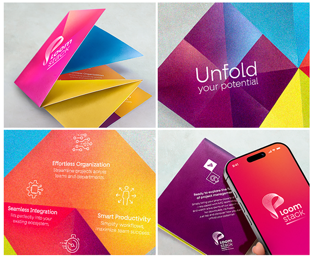
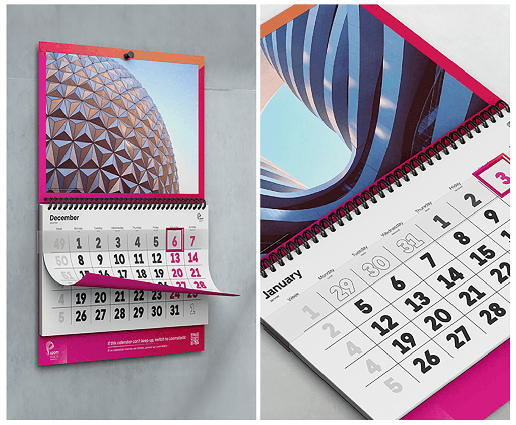
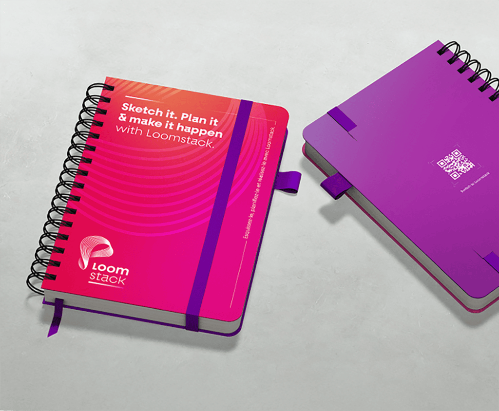
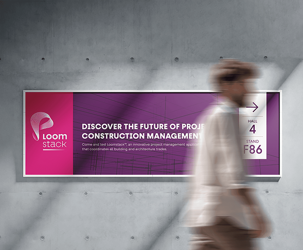
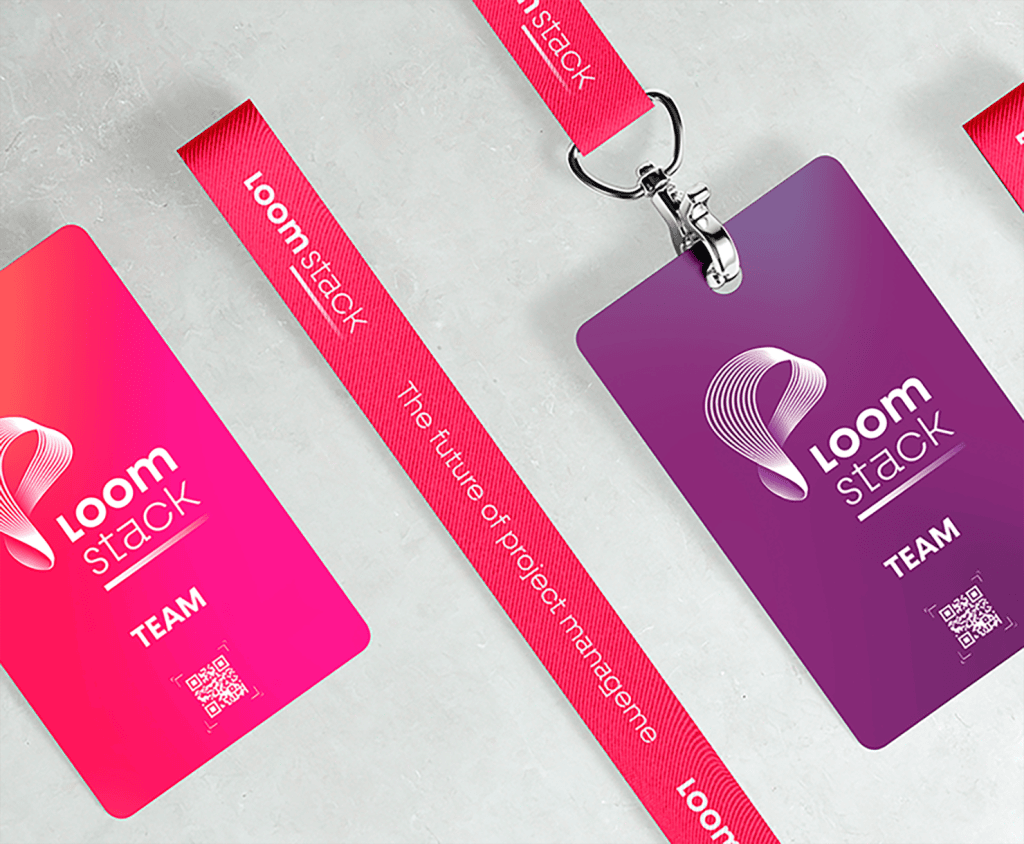
Tangible assets of a deeptech company, for professional trade show
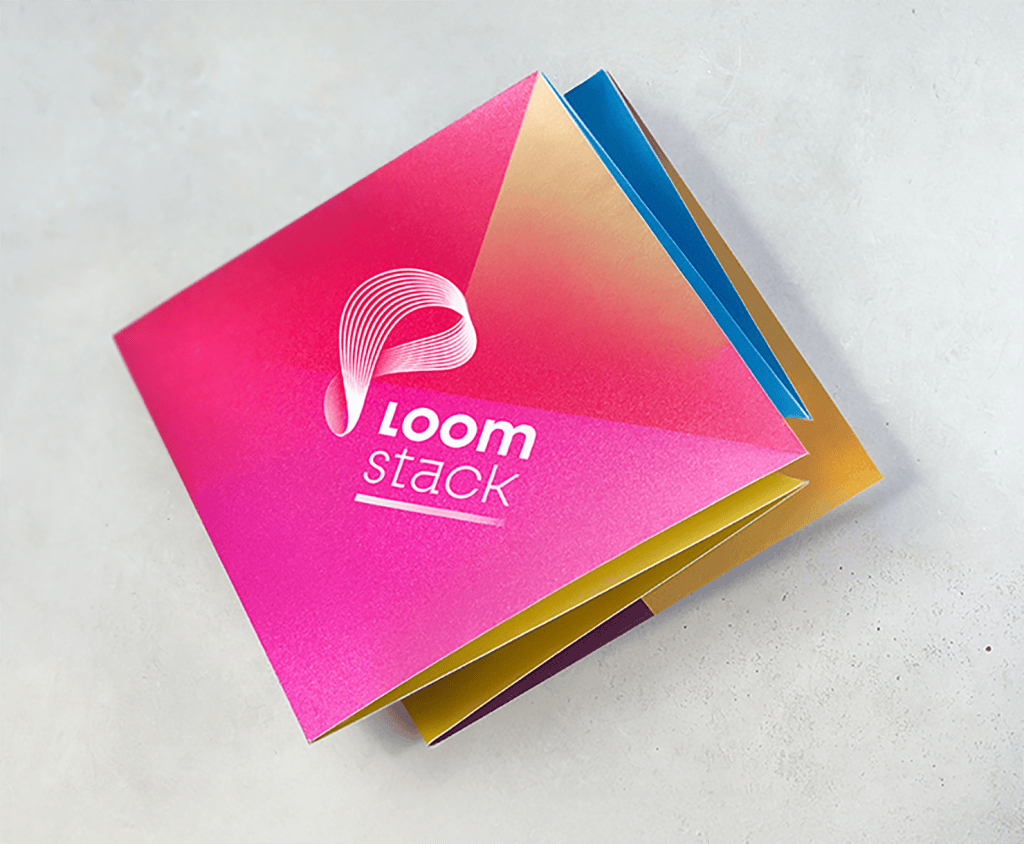
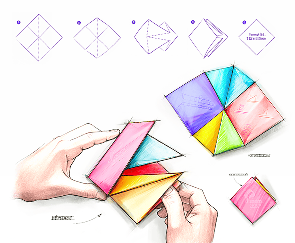
Kraft Design created a turnkey trade show activation for Loomstack (a SaaS for the construction industry) at VivaTech: a pop-up NFC card for tracked demos, a print calendar with a QR code, an eco-designed notebook, etc. These hybrid materials, combining premium design and technology, maximized visibility, generated leads, and united a community of early adopters. A project to make deep tech truly tangible while limiting environmental impact.
Areas of intervention:
- Hybrid print-digital media design
- Sustainable eco-design of goodies
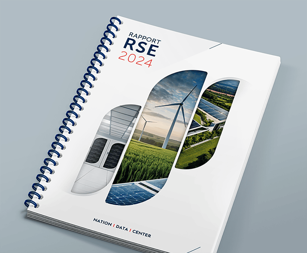
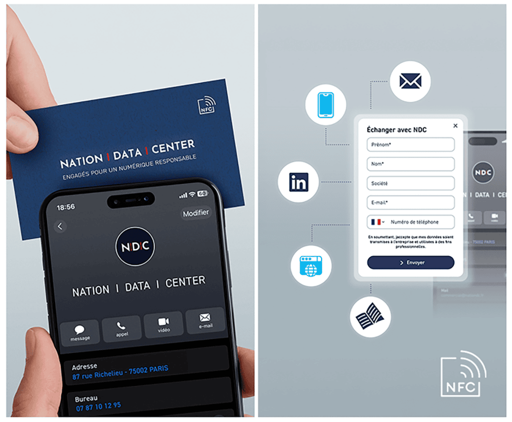
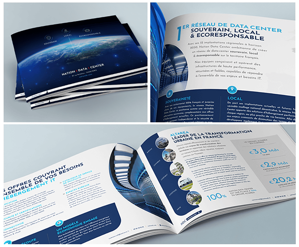
CSR print for responsible digital
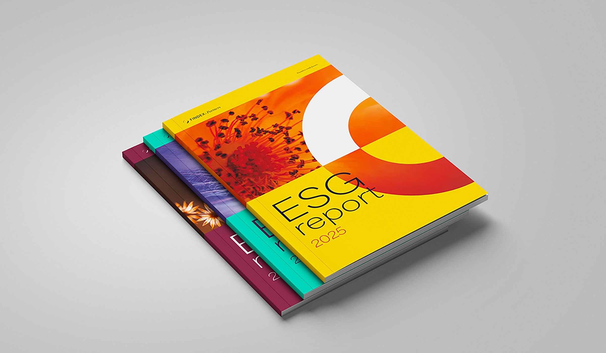
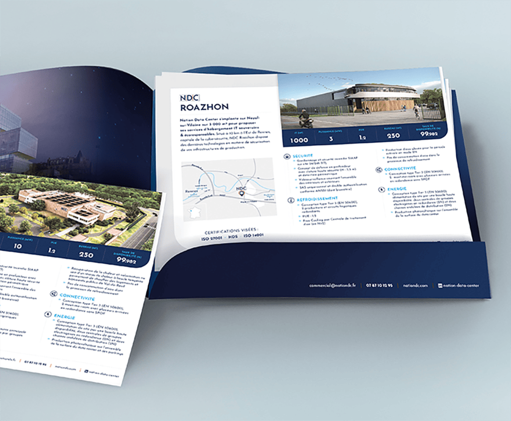
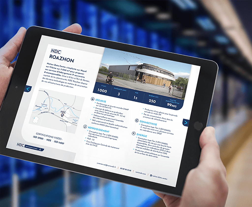
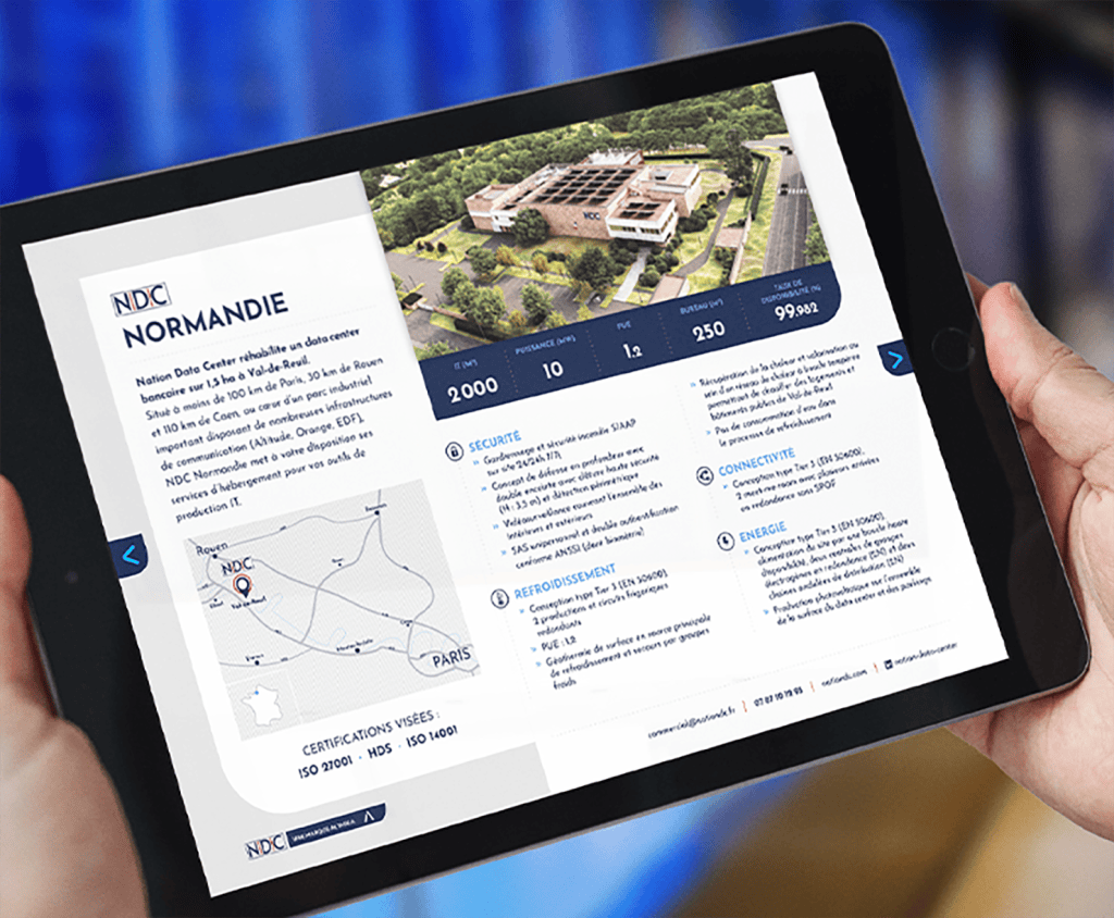
Kraft Design helped a responsible digital player create its first print materials: a glue-free bound CSR report and a sales brochure with product sheets. These tools, printed locally on 100% recycled paper (%), include QR codes and NFC cards for optimized content access. This project combines impactful design, eco-design, and the humanization of a technological offering to strengthen B2B credibility and investor appeal.
Areas of intervention:
- Print Communication Strategic Consulting
- Graphic design and layout of materials
- Manufacturing monitoring and responsible production
Premium website and print materials
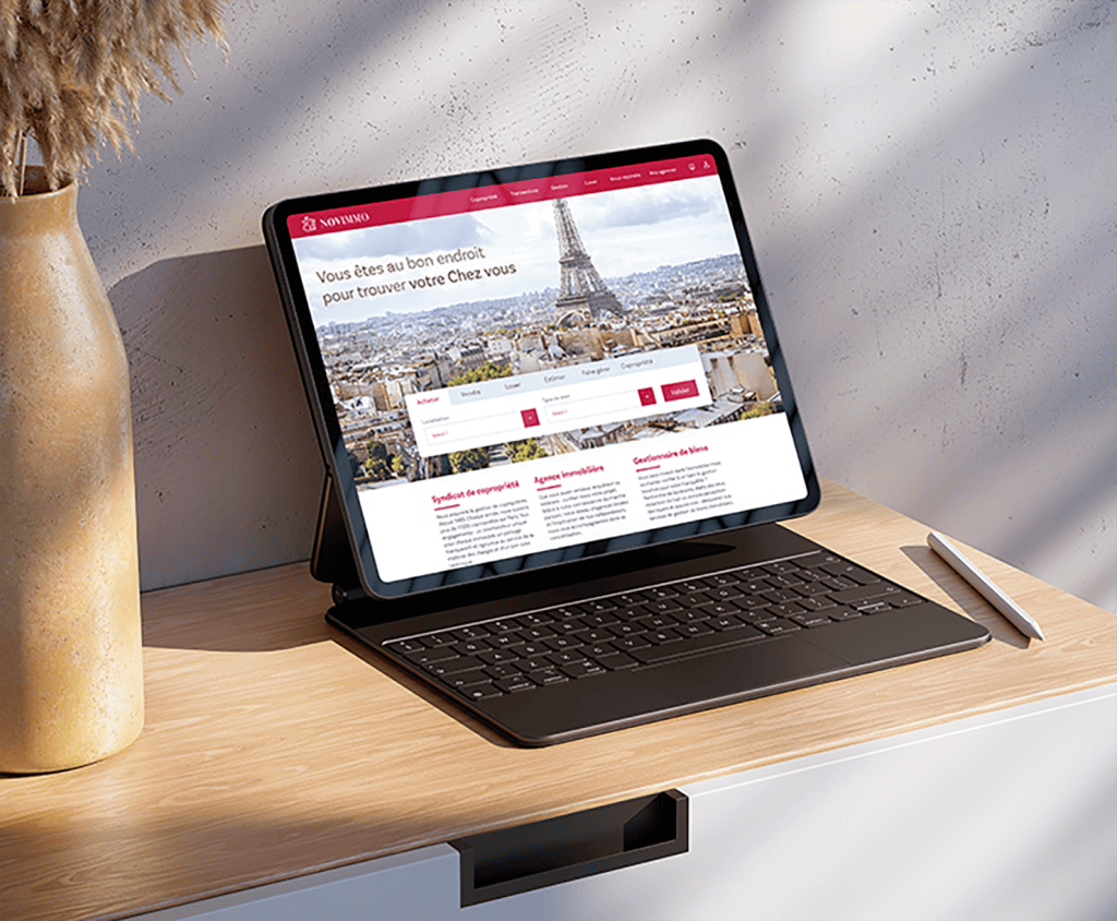
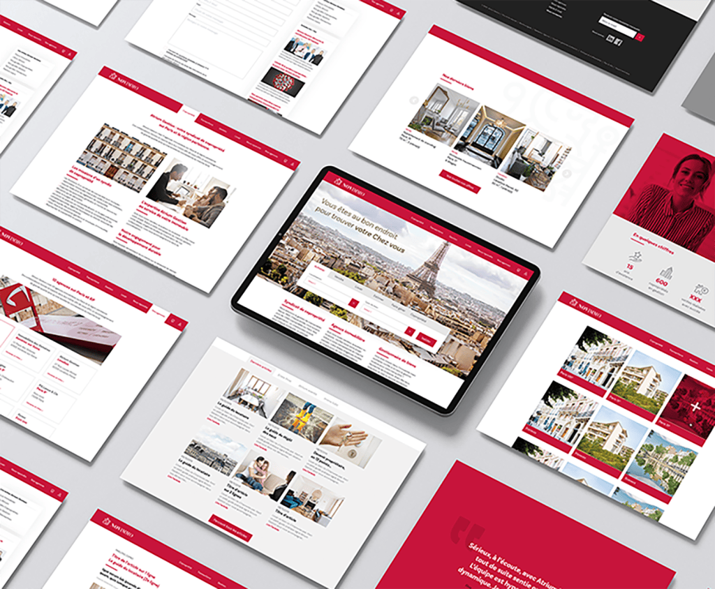
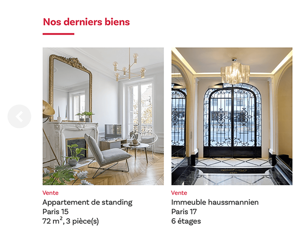
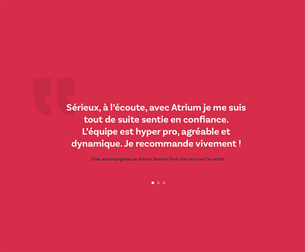
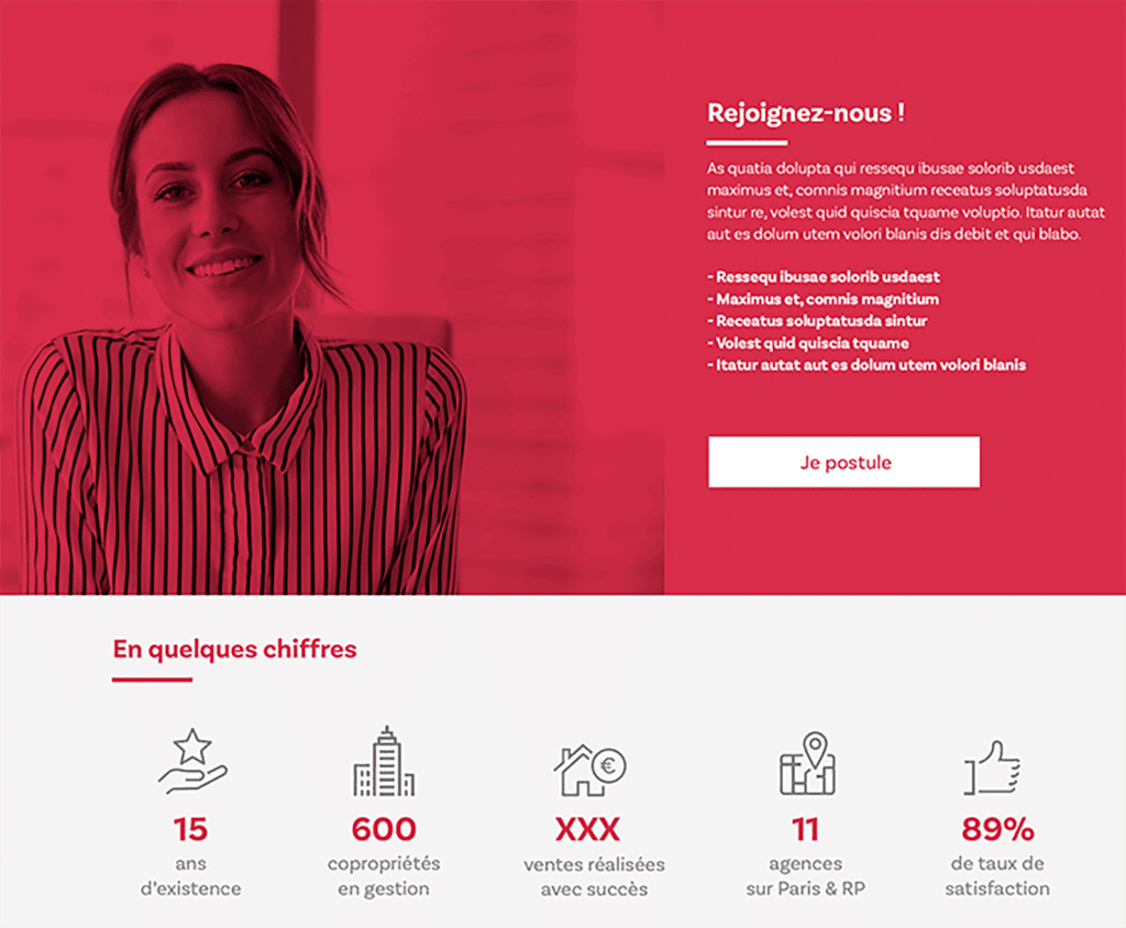
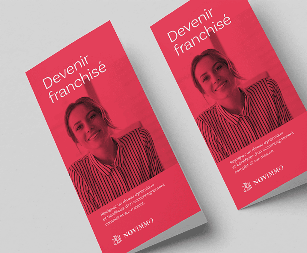
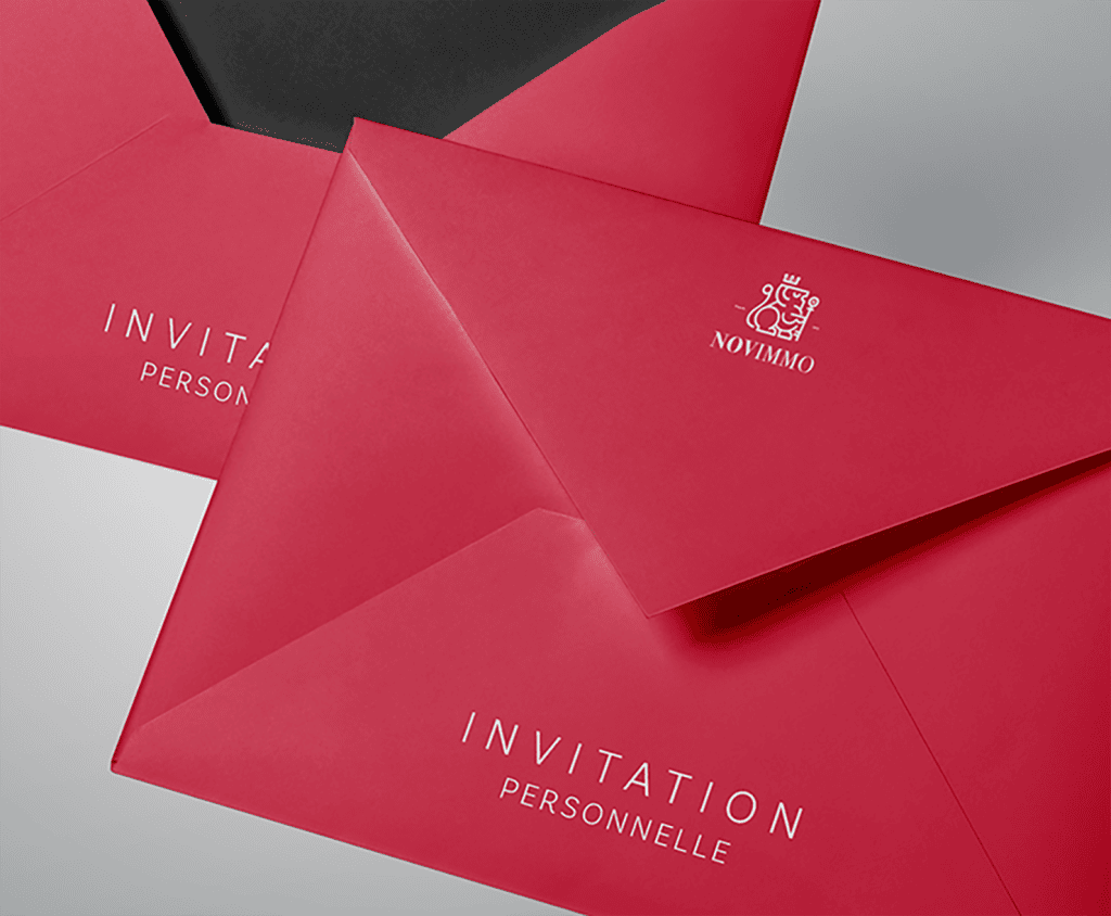
Kraft Design created a visual identity for a realtor specializing in the sale of exceptional properties, developing print and digital communication materials, initially focusing on their website. Our mission: to visually translate the sophistication, elegance, and rarity that define these offerings. The logo, graphic charter, and print and digital materials were designed to appeal to a high-end clientele by highlighting every detail. The result: insightful, coherent, timeless branding that is as minimalist as it is sophisticated, aimed at showcasing prestigious offerings.
SaaS Platform Branding
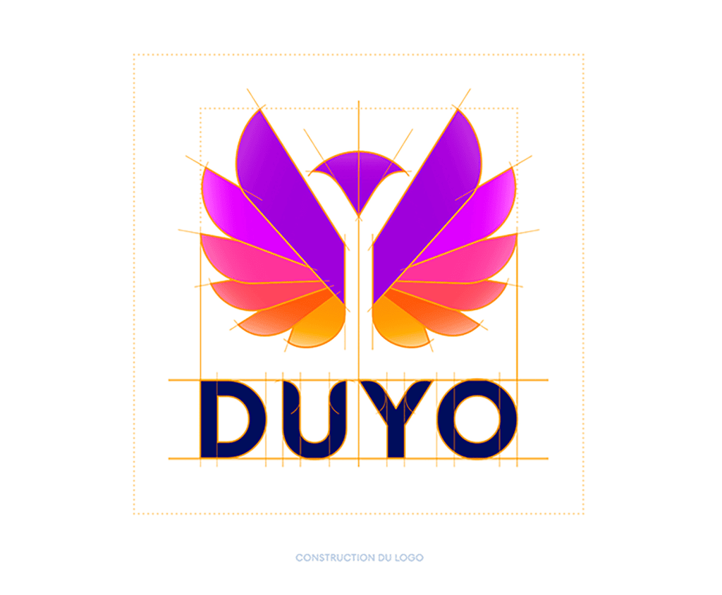
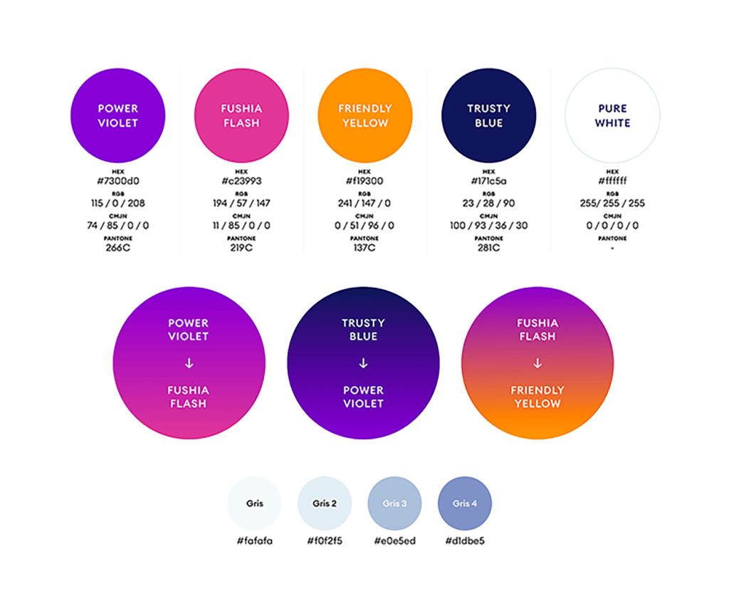
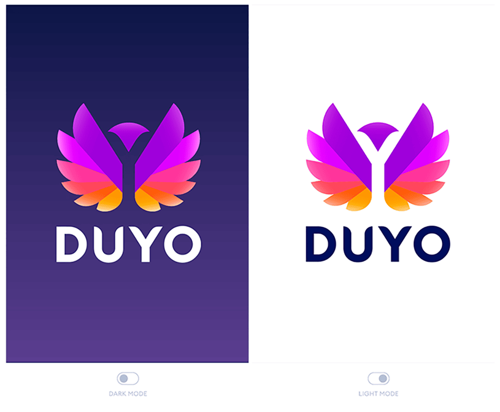
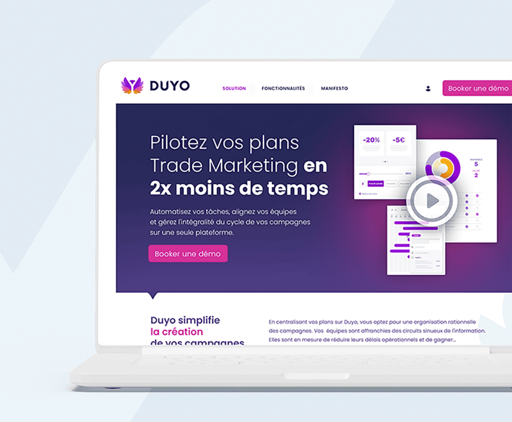
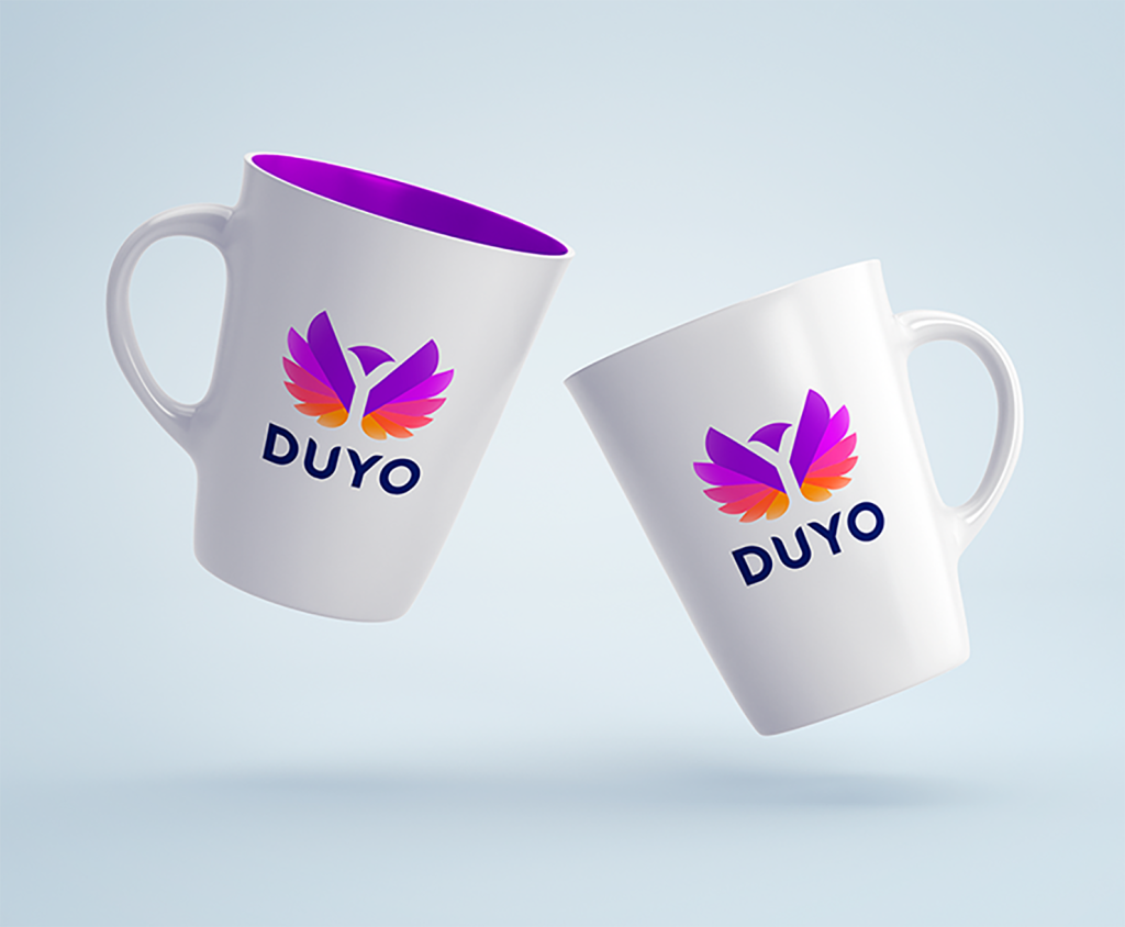
Kraft Design created the brand identity for Duyo, a SaaS platform for Trade Marketing management. Our mission was to translate its values of simplicity, transparency, and kindness into impactful branding, to smooth the relationship between Distributors and Brands. A logo, graphic charter, and various print/digital materials were created to establish a strong, differentiating image aligned with its promise: to remove friction and give meaning to business collaborations.
Areas of intervention:
- Brand Strategy / Branding
- Visual identity creation
- Logo and graphic charter
- Logo and graphic charter
- Deployment of print and digital media
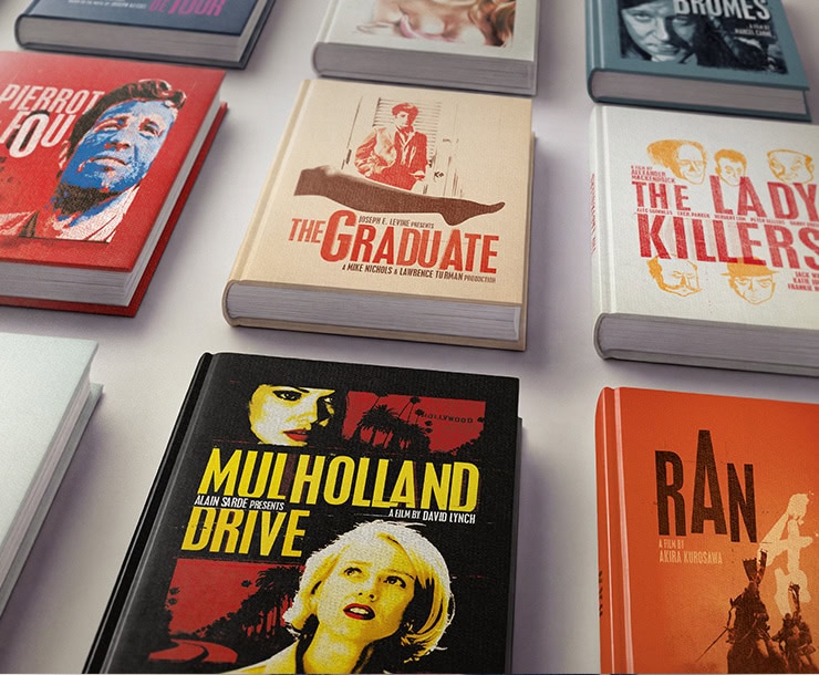
Cinema collection
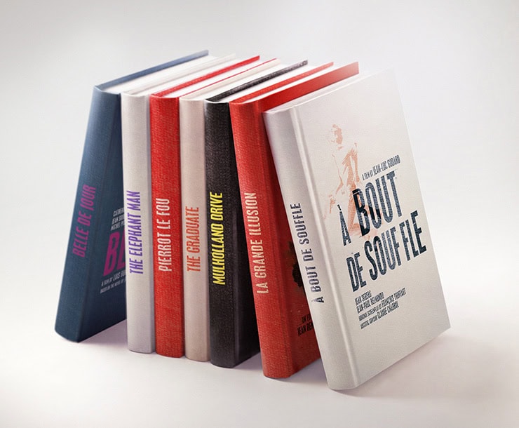
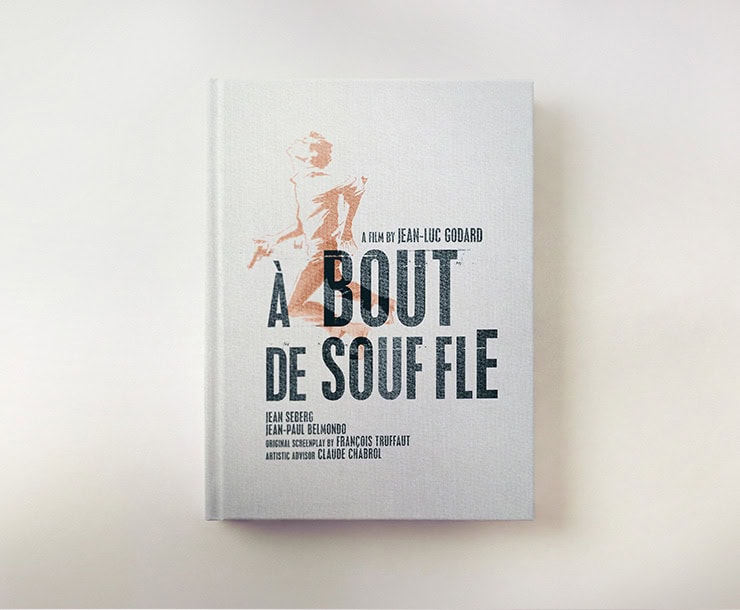
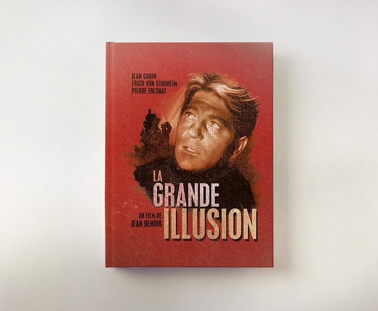
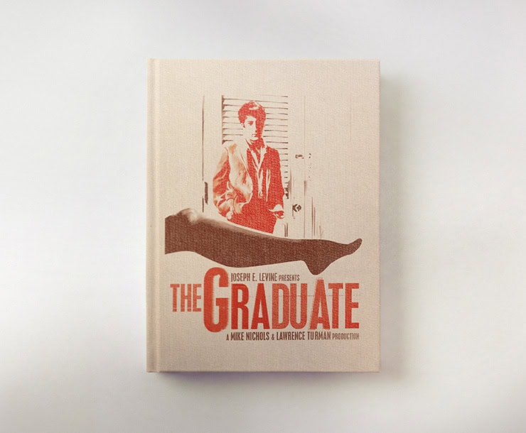
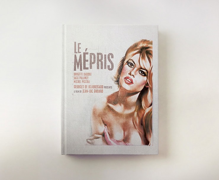
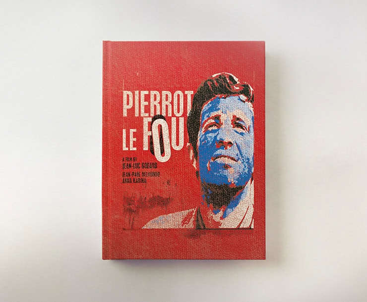
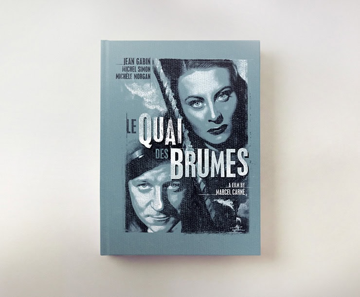
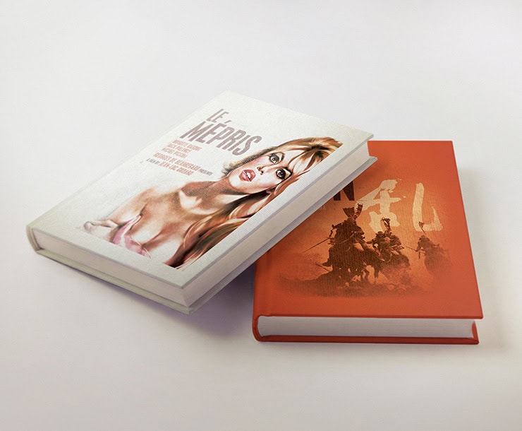
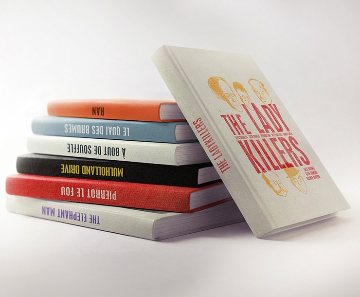
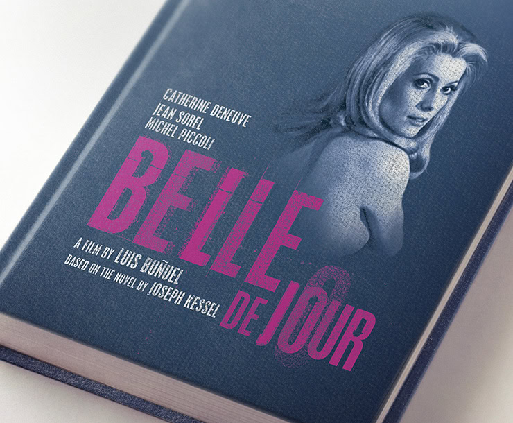
Kraft Design has created an editorial visual identity for a book collection dedicated to cult auteur films, whether old or new. The challenge? To create strong graphic consistency across each publication while preserving the unique identity of each film. Typography, color palettes, and patterns are inspired by the cinematic universe, blending timeless elegance with a contemporary touch. The result is an immersive collection where each book pays homage to its film while adhering to a unified and modern editorial line.